Consistent with the anticipatory approach outlined in "A DEW Line for Market Operators" yesterday, I monitor this continuous feedback loop between the economy and the stock market in a number of ways. One of them entails comparing the condition of the proprietary U.S. Economic Index (USEI) with the condition of the nonproprietary Standard & Poor's (S&P) 500 (SPX).
Mixing Institute for Supply Management manufacturing and nonmanufacturing figures with a special sauce, I developed the USEI in an effort to capture all of my country's economic activity in a single number I can employ in the guidance of my investing and trading. A fool's errand? Maybe. Maybe not.
Thanks to my comparative tracking of the S&P 500 and USEI (among other indicators), I began raising cash in both the Investing Portfolio and the Trading Portfolio last May 4. As a market chameleon, I also more or less swapped the bull suit with the bear suit. And I will show you why.
SPX and USEI End-of-Month (EOM) Values, January 2008-August 2011
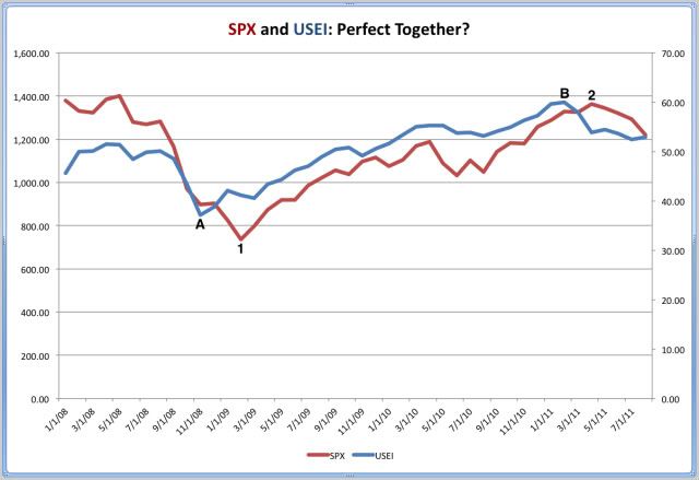
N.B.: The SPX scale is on the left; the USEI scale is on the right.
Source: Risky Business Chart Based on ISM-Founded
Proprietary and Yahoo! Finance Data
As its title indicates, this chart compares the S&P 500's EOM values with the USEI's EOM values since the latter's inception. From left to right, one can see four data points highlighted as A, 1, B, and 2. Below are explanations of these points:
-- Point A marks the most recent cyclical trough in the USEI: 37.13 in November 2008.
-- Point 1 marks the most recent cyclical trough in the SPX: 735.09 in February 2009.
-- Point B marks the most recent cyclical peak in the USEI: 59.94 in February 2011.
-- Point 2 marks the most recent cyclical peak in the SPX: 1,363.61 in April 2011.
Based on my interpretation of the USEI's short history, I believe it has served primarily as a leading indicator and secondarily as a coincident indicator of the S&P 500's direction.
With the USEI's current reading at 52.91 -- more than 50.00 indicates expansion, less than 50.00 suggests contraction -- I think it is clearly flashing a warning sign that the economy is languishing at stall speed at this time. Along the same line, the patterns in my economic and market data look familiar. "Too Familiar."
No comments:
Post a Comment