Thursday, September 22, 2011

'Operation Twist I' and SPX Behavior

A half-century ago, the U.S. Department of the Treasury and Federal Reserve conducted "Operation Twist I" under economic conditions described well by Titan Alon and Eric Swanson last April 25 in their "Operation Twist and the Effect of Large-Scale Asset Purchases," which I mentioned in "Go, Chubby, Go: Let's Twist Again!" this week.

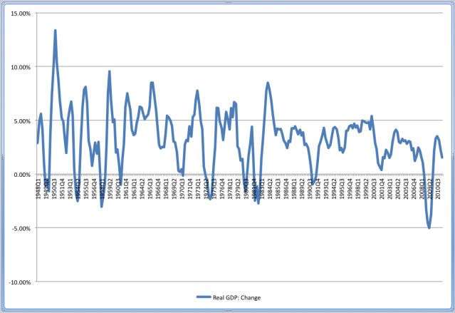
Yesterday, the Federal Open Market Committee (FOMC) announced "Operation Twist II" under economic conditions described well in an many places virtually every day, including this very blog (e.g., "GDP Slide Signals Recession. Soon.").

There are similarities and differences in the U.S. economic conditions existing during the two periods. One obvious similarity centers on the status of the business cycle, meaning the above-referenced R-word was or is on almost everybody's lips in both cases. One obvious difference centers on the country's debt as a percentage of gross domestic product, which was not too bad in 1961 but is not too good in 2011.

Given this mishmash, it may or may not be helpful to examine the market performance of the Standard & Poor's (S&P) 500 (SPX) in the wake of the launch of "Operation Twist I" on Feb. 2, 1961. But I did it, anyway.

With a common baseline of Feb. 1, 1961, the four charts below show the S&P 500's behavior during the following one-month, three-month, six-month, and one-year periods, respectively:


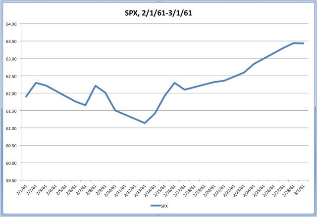
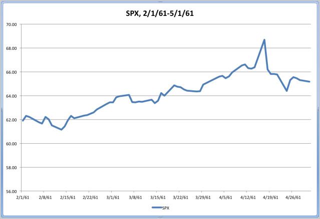
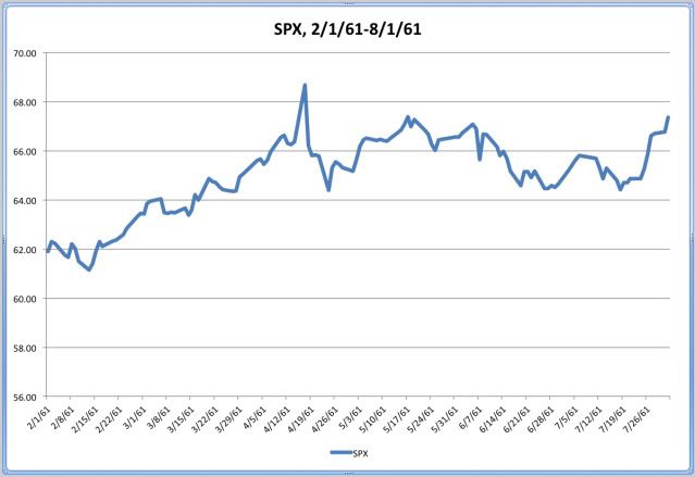
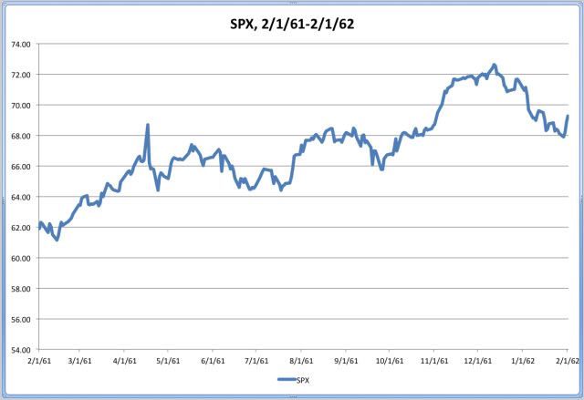
Source: Risky Business Charts Based on Yahoo! Finance Adjusted Closing-Price Data

If past is prologue, then the recent equity-market crash may be comparatively short-lived. After all, the Fed will be driving financial-market participants out of the long end and into the short end of the U.S. Treasury yield curve, as well as higher-risk assets.

If past is not prologue, then the recent stock-market crash may be relatively long-lived. Clearly, aggregate demand is lacking in the U.S., and nearly all available evidence indicates this circumstance is other than either a local or a temporary phenomenon.

You pays your money, and you takes your chances.

Wednesday, September 21, 2011

'Twist' Tops the Ops at the FOMC

In a well-choreographed move, the Federal Open Market Committee (FOMC) OK'd today by a 7-3 vote a new cover of "Operation Twist." The original version was discussed in "Go, Chubby, Go: Let's Twist Again!" on Monday.

According to the FOMC statement belatedly released at the conclusion of its two-day meeting: "[T]he committee decided today to extend the average maturity of its holdings of securities. The committee intends to purchase, by the end of June 2012, $400 billion of Treasury securities with remaining maturities of [six] years to 30 years and to sell an equal amount of Treasury securities with remaining maturities of [three] years or less. This program should put downward pressure on longer-term interest rates and help make broader financial conditions more accommodative. The committee will regularly review the size and composition of its securities holdings and is prepared to adjust those holdings as appropriate."

The FOMC also noted: "To help support conditions in mortgage markets, the committee will now reinvest principal payments from its holdings of agency debt and agency mortgage-backed securities in agency mortgage-backed securities. In addition, the committee will maintain its existing policy of rolling over maturing Treasury securities at auction."

All things considered, I believe this plan may have a limited effect on the U.S. economy, but I think its potential impact on the yield curve may constitute a headwind in terms of the profitability of certain financial institutions (e.g., banks).

Tuesday, September 20, 2011

You Say To-may-to, I Say To-mah-to

In "GDP Slide Signals Recession. Soon." on Sunday, I indicated my fact-based opinion is that the U.S. economy either has shifted or is shifting to contraction from expansion.

One key factor in the forming of this opinion is the anemic 1.55% change in real gross domestic product (GDP) recorded during the most recently reported four-quarter period (i.e., between the third quarter of last year and the second quarter of this year.).

Support for this notion can be found in Forecasting Recessions Using Stall Speeds, a Federal Reserve Board staff working paper authored by Jeremy J. Nalewaik that was published last April 14.

According to Nalewaik: "This paper presents evidence that the economic stall speed concept has some empirical content, and can be moderately useful in forecasting recessions. Specifically, output tends to transition to a slow-growth phase at the end of expansions before falling into a recession."

Of course, the Washington-based economist adds, "[M]odels using output growth alone produce a considerable number of false positive recession signals, [so] adding the slope of the yield curve, the percent change in housing starts, and the change in the unemployment rate to the model reduces false positives and improves recession forecasting."

Meanwhile, Nalewaik contends, "GDI [gross domestic income] provides a better measure of output growth than GDP, its better-known counterpart, and in our work here, while stall phases are evident in GDP, they are more plainly visible in GDI."

Harrumph.

Monday, September 19, 2011

Go, Chubby, Go: Let's Twist Again!

With the Federal Open Market Committee (FOMC) attempting to save the U.S. economy from itself once again at a two-day meeting this week, it appears a new cover of "Operation Twist" may be atop the playlist of at least some of the committee's members.

The Federal Reserve conducted the original Operation Twist a half-century ago under circumstances Titan Alon and Eric Swanson describe well in their "Operation Twist and the Effect of Large-Scale Asset Purchases," which appeared in the FRBSF [Federal Reserve Bank of San Francisco] Economic Letter last April 25:

"John F. Kennedy was elected president in November 1960 and inaugurated on January 20, 1961. The U.S. economy had been in recession for several months, so the incoming Administration and the Federal Reserve wanted to lower interest rates to stimulate the weak economy.

"However, Europe was not in a recession at the time and European interest rates were higher than those in the United States. Under the Bretton Woods fixed exchange rate system then in effect, this interest rate differential led cross-currency arbitrageurs to convert U.S. dollars to gold and invest the proceeds in higher-yielding European assets. The result was an outflow of gold from the United States to Europe amounting to several billion dollars per year, a very large quantity that was a source of extreme concern to the Administration and the Federal Reserve.

"The Kennedy Administration’s proposed solution to this dilemma was to try to lower longer-term interest rates while keeping short-term interest rates unchanged -- an initiative now known as 'Operation Twist' in homage to the dance craze then sweeping the nation.

"The idea was that business investment and housing demand were primarily determined by longer-term interest rates, while cross-currency arbitrage was primarily determined by short-term interest rate differentials across countries. Policymakers reasoned that, if longer-term interest rates could be lowered without affecting short-term yields, the weak U.S. economy could be stimulated without worsening the outflow of gold."


Hmm. In the anticipated remake of Operation Twist, the Fed is expected to first sell shorter-term U.S. Treasury securities already on its books and then employ the proceeds to buy longer-term U.S. Treasury securities, with little or no effect on the bottom line of its overall balance sheet. Meanwhile, the cross-border flow of gold seems to be a nonissue this time around, given President Richard Nixon's closing of the gold window in 1971, which ended the convertibility between the precious metal and U.S. dollars. Hmm.

In the words of one of my favorite financial-market observers after the FOMC's announcement last Nov. 3 that it would be monetizing an additional $600 billion in U.S. debt by purchasing an assortment of U.S. Treasury securities, "I believe this plan may have a limited impact on the U.S. economy."

Because of the inviolable Risky Business Law of Unintended Consequences, however, this apparent new program could boost prices in certain financial-asset classes, such as commodities. (As I once noted elsewhere, one effect of this unbreakable law appears to be that every time I slip-'n'-slide my way into the shower of the RB Executive Washroom, the telephone rings. Given my unique blend of astigmatism and myopia, this could one day lead to a pretty humorous obituary.)

Operation Twist: Those oldies but goodies remind me of you* . . .


*Props to Little Caesar & the Romans

Sunday, September 18, 2011

GDP Slide Signals Recession. Soon.

If the U.S. economy has not already moved to contraction from expansion, then I believe there is a high probability it will make the transition by the close of the first half of next year.

Moreover, I think there is an intermediate probability this event will be a fait accompli by the end of the second half of this year.

One reason I reached these conclusions centers on my recent historical statistical study of the real gross domestic product (GDP) data series publicly available on the Department of Commerce's Bureau of Economic Analysis (BEA) Web site.

Methodologically, I began by calculating the percentage change in real GDP for each rolling four-quarter period in the quarterly data series, which ranges between 1947's first quarter (1947Q1) and 2011's second quarter (2011Q2). Naturally, the 1947 data constitute the baseline. Below is a chart with an overview of the results of these calculations:

Real GDP: Percentage Change During Rolling
Four-Quarter (4Q) Periods, 1948Q1-2011Q2


Source: Risky Business Analysis and Chart Based on BEA Data

Basically, there are 254 data points in the series. The median value is 3.18%, the mean value is 3.25%, and the standard deviation is 2.76%.

Employing the most recently recorded value of 1.55% as my dividing line, I found 197 data points are higher and 56 data points are lower.

For the purpose of this study, I was uninterested in the comparatively high 197 values, but I was interested in the relatively low 56 values, which I examined in terms of their proximity to U.S. economic contractions as determined by the National Bureau of Economic Research's Business Cycle Dating Committee.

I found 40 of them were registered during recessions and 16 of them were registered within five quarters of recessions (i.e., either before or after contractions). Both the latter group of data points and the most recently recorded value of 1.55% are shown in the following table:

Real GDP: Percentage Change Over Rolling
4Q Periods and Proximity to Recession, 17 Quarters


Source: Risky Business Analysis and Table Based on BEA Data

Based not only on the data I have examined in this table in particular but also on the data I have examined in this study in general -- as well as other sources, such as the proprietary U.S. Economic Index (USEI) discussed in "You Got to Know When to Hold 'em" -- I am convinced the most recently recorded value of 1.55% is more likely to be associated with the next recession than it is to be associated with the last recession.

Could my conviction be misplaced? Sure. For example, I remember well the 2004 New York Yankees, unique in the annals of Major League Baseball as the only team to lose a seven-game playoff series subsequent to taking a 3-0 lead in the same series (i.e., there are no sure things -- not in baseball, not in the economy, not in the financial markets, and not in life).

Saturday, September 17, 2011

The R-Word and the Legion of Doom

While I continue to work on the Risky Business blog post about the current status of the U.S. economic cycle that I mentioned in "Synchronicity in the Blogosphere" yesterday, I came across "The R-Word Index: Up Means Down -- The Economist's Gauge of Gloom" today.

According to its anonymous author, "The Economist's informal R-word index tracks the number of newspaper articles [in either the Financial Times or The Wall Street Journal] that use the word 'recession' in a quarter."

Speaking of the index, he or she notes, "[I]t boasts a decent record: previous incarnations of the index pinpointed the start of American recessions in 1990 and 2007." And that, of course, makes the index's visible rise this month all the more alarming.

In a comment that could have been accurately aimed at your humble correspondent, the writer then cleverly concludes, "[T]he hacks are getting anxious."

Friday, September 16, 2011

Synchronicity in the Blogosphere

The "10 Friday AM Reads" (authored by Barry Ritholtz) at The Big Picture blog today leads with a link to "Do Equity Price Drops Foreshadow Recessions?" (penned by John C. Bluedorn, Jörg Decressin, and Marco E. Terronesat) at the Vox blog.

Meanwhile, a currently untitled piece (written by me) at the Risky Business blog that also centers on the U.S. economy's next move to contraction from expansion is in the preparation stage, with a tentative publication date of Sunday. (In my case, however, all the foreshadowing will be done by the real gross domestic product).

Synchronicity in the blogosphere: Gotta love it!

Thursday, September 15, 2011

TED Spread: Seems Like Old Times

Because I am not a debt guy but an equity guy, I spent little or no time monitoring the condition of the credit market until the middle of September 2008.

Due to the credit-market freeze that became apparent even to the likes of me at that time, however, I have been tracking its condition on a daily basis since then.

My primary metric for doing so is the TED spread, which is the difference between the three-month U.S. Treasury-bill interest rate and the three-month London interbank offered rate (LIBOR). The acronym is a historical artifact derived from T-bill and ED, the ticker symbol for the Eurodollar futures contract formerly employed in the place now occupied by the LIBOR.

Although I personally am content with the TED spread, Matt Phillips of The Wall Street Journal covered a handful of other helpful credit-market metrics in his "Credit Stress Gauges: Just How Bad is It Out There?" when the credit market experienced a period of distress last year.

Based on my interpretation of Bloomberg.com's TED spread charts, the closing spread has more than doubled in less than seven weeks, as it has risen to about 0.35% (or 34.91 basis points) yesterday from about 0.16% (or 16.40 bps) on July 29.

By way of background, the closing spread spiked to its all-time high of about 4.64% (or 463.62 bps) on Oct. 10, 2008. Therefore, the credit crunch now does not appear to be in the same league as the credit crunch then. Yet.

However, the European Central Bank's (ECB's) announcement today that it will conduct three U.S.-dollar liquidity-providing operations by the end of the year -- in coordination with the Federal Reserve, Bank of England, Bank of Japan, and Swiss National Bank -- indicates to me credit conditions could get worse before they get better.

In one plausible scenario, the ECB's operations could serve as coping mechanisms for financial institutions that are affected by the widely assumed coming default on debt issued by the government of Greece.

As a financial-market wag once observed, the credit market is anything but LIBORing.

Wednesday, September 14, 2011

You Got to Know When to Hold 'em

Mirrored by about a zillion data points of light in either AppleWorks or Microsoft Excel spreadsheets on multiple media here at the home office of my Risky Business, changes in the U.S. economy are reflected by changes in its equity market. And vice versa.

Consistent with the anticipatory approach outlined in "A DEW Line for Market Operators" yesterday, I monitor this continuous feedback loop between the economy and the stock market in a number of ways. One of them entails comparing the condition of the proprietary U.S. Economic Index (USEI) with the condition of the nonproprietary Standard & Poor's (S&P) 500 (SPX).

Mixing Institute for Supply Management manufacturing and nonmanufacturing figures with a special sauce, I developed the USEI in an effort to capture all of my country's economic activity in a single number I can employ in the guidance of my investing and trading. A fool's errand? Maybe. Maybe not.

Thanks to my comparative tracking of the S&P 500 and USEI (among other indicators), I began raising cash in both the Investing Portfolio and the Trading Portfolio last May 4. As a market chameleon, I also more or less swapped the bull suit with the bear suit. And I will show you why.

SPX and USEI End-of-Month (EOM) Values, January 2008-August 2011


N.B.: The SPX scale is on the left; the USEI scale is on the right.

Source: Risky Business Chart Based on ISM-Founded
Proprietary and Yahoo! Finance Data

As its title indicates, this chart compares the S&P 500's EOM values with the USEI's EOM values since the latter's inception. From left to right, one can see four data points highlighted as A, 1, B, and 2. Below are explanations of these points:

-- Point A marks the most recent cyclical trough in the USEI: 37.13 in November 2008.

-- Point 1 marks the most recent cyclical trough in the SPX: 735.09 in February 2009.

-- Point B marks the most recent cyclical peak in the USEI: 59.94 in February 2011.

-- Point 2 marks the most recent cyclical peak in the SPX: 1,363.61 in April 2011.

Based on my interpretation of the USEI's short history, I believe it has served primarily as a leading indicator and secondarily as a coincident indicator of the S&P 500's direction.

With the USEI's current reading at 52.91 -- more than 50.00 indicates expansion, less than 50.00 suggests contraction -- I think it is clearly flashing a warning sign that the economy is languishing at stall speed at this time. Along the same line, the patterns in my economic and market data look familiar. "Too Familiar."

Tuesday, September 13, 2011

A DEW Line for Market Operators

As people of a certain age recall -- unlike me -- the U.S. Air Force assumed operational control of the Distant Early Warning (DEW) Line in 1957. It was an idea whose time had come about five years earlier, the brainchild of eggheads, I mean, geeks, I mean, geniuses at the Massachusetts Institute of Technology.

The DEW Line consisted of radar stations at the top of the world, semicircling it like a hacked-in-half string of pearls from Alaska to Greenland. Its purpose was to give the U.S. and the rest of the Western Hemisphere advance warning in case of an air attack launched by the Soviet Union during the hottest days of the Cold War.

(Speaking of temperatures, the most enduring memory of one military veteran of my acquaintance who was stationed in the Aleutian Islands during the 1950s focuses not on the bone-chilling cold of the long Alaskan winter but on the skin-piercing skeeters of the short Alaskan summer! But I digress.)

In a fit of free association years ago, I concluded it would be wise for all investors and traders to have our own DEW Lines, which could provide us with early warnings before our portfolios come under attack.

At first, my personal DEW Line consisted of the most traditional of market internals, namely, the New York Stock Exchange's advance-decline line and its ratio of new highs to new lows. Even now, I track these figures every trading day at Yahoo! Finance.

Over the years, however, I have added an impressive number of other enhancements to my DEW Line, including but not limited to the Securities Market Credit Risk Rank discussed in "Thirteen Ways of Looking at Risk" yesterday.

In an uncertain time, I am certain to be standing guard "All Along the Watchtower":
All along the watchtower . . .
Gotta beware gotta beware I will

Monday, September 12, 2011

Thirteen Ways of Looking at Risk

I do not know which to prefer,
The beauty of inflections
Or the beauty of innuendoes,
The blackbird whistling
Or just after.


With triskaidekaphobia on all our minds here at the home office of my Risky Business -- even though it is a day early -- I believe there will be no official action taken to revoke my creative license because of the apparent headline claim that we have only 13 ways of looking at risk in the equity market.

In fact, I think we have an infinite number of ways of looking at risk in the stock market.

One of them centers on New York Stock Exchange (NYSE) securities-market-credit data, which our droogies there report monthly.

For the months between January 2003 and July 2011, the NYSE reported these data via three discrete series: Margin Debt, Free Credit Cash Accounts, and Credit Balances in Margin Accounts.

Drawing on these three data series, I have developed a comparative and dynamic measure of equity-market risk, which is brought up-to-date each month and known as the Securities Market Credit Risk Rank (SMC Risk Rank).

A high SMC Risk Rank indicates the stock market may be close to a significant peak, and a low SMC Risk Rank suggests it may be close to a significant trough. In my interpretation, the term close in this context means within three to six months. Therefore, I consider this metric most useful not tactically (i.e., in positioning for the short term) but strategically (i.e., in positioning for the long term).

Following are current tables showing the six months with the highest SMC Risk Ranks and the six months with the lowest SMC Risk Ranks:

Highest SMC Risk Ranks
(As of July 2011)


Source: Risky Business Analysis and Table Based on NYSE Data

Lowest SMC Risk Ranks
(As of July 2011)


Source: Risky Business Analysis and Table Based on NYSE Data

Based on my reading of these tables and their underlying data sets, I believe the equity market had been cruisin' for a bruisin' since the first quarter of this year. Moreover, I think the SMC Risk Rank of 28 for last July may mean the masters of the universe -- I mean, the margin clerks of the world -- may have more work to do as stock-market participants move from being overleveraged to being underleveraged.

As a risk-management measure, I therefore have my crash helmet, chest harness, and seat belt all securely fastened.

Sunday, September 11, 2011

There Are No Coincidences

A U.S. citizen, a New York resident, a grateful son, an equity investor, and an options trader, I stand on the shoulders of giants.

With respect to the investing in equities and the trading of options, everyone is my better in that I may learn from him or her.

Future blog posts will discuss a little -- or a lot -- of the teachings I have incorporated into my work since becoming a serious investor and trader in 2003.

Foundationally, I note both Benjamin Graham's The Intelligent Investor and Edwin Lefèvre's Reminiscences of a Stock Operator have benefited me a great deal, as has Sun Tzu Wu's The Art of War.

And, of course, Peter L. Bernstein's Against the Gods: The Remarkable Story of Risk has aided me in dealing with the financial markets' inherent uncertainties in a relatively quantifiable way, while Nassim Nicholas Taleb's The Black Swan: The Impact of the Highly Improbable has helped me in dealing with them in an absolutely unquantifiable way.

Which is why neither investing nor trading is my business: Managing risk is my business.